Basic UMAP Parameters
UMAP is a fairly flexible non-linear dimension reduction algorithm. It seeks to learn the manifold structure of your data and find a low dimensional embedding that preserves the essential topological structure of that manifold. In this notebook we will generate some visualisable 4-dimensional data, demonstrate how to use UMAP to provide a 2-dimensional representation of it, and then look at how various UMAP parameters can impact the resulting embedding. This documentation is based on the work of Philippe Rivière for visionscarto.net.
To start we’ll need some basic libraries. First numpy will be needed
for basic array manipulation. Since we will be visualising the results
we will need matplotlib and seaborn. Finally we will need
umap for doing the dimension reduction itself.
import numpy as np
import matplotlib.pyplot as plt
from mpl_toolkits.mplot3d import Axes3D
import seaborn as sns
import umap
%matplotlib inline
sns.set(style='white', context='poster', rc={'figure.figsize':(14,10)})
Next we will need some data to embed into a lower dimensional
representation. To make the 4-dimensional data “visualisable” we will
generate data uniformly at random from a 4-dimensional cube such that we
can interpret a sample as a tuple of (R,G,B,a) values specifying a color
(and translucency). Thus when we plot low dimensional representations
each point can colored according to its 4-dimensional value. For this we
can use numpy. We will fix a random seed for the sake of
consistency.
np.random.seed(42)
data = np.random.rand(800, 4)
Now we need to find a low dimensional representation of the data. As in
the Basic Usage documentation, we can do this by using the
fit_transform() method on a UMAP object.
fit = umap.UMAP()
%time u = fit.fit_transform(data)
CPU times: user 7.73 s, sys: 211 ms, total: 7.94 s
Wall time: 6.8 s
The resulting value u is a 2-dimensional representation of the data.
We can visualise the result by using matplotlib to draw a scatter
plot of u. We can color each point of the scatter plot by the
associated 4-dimensional color from the source data.
plt.scatter(u[:,0], u[:,1], c=data)
plt.title('UMAP embedding of random colours');
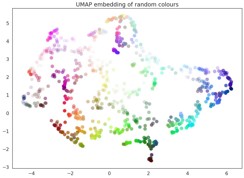
As you can see the result is that the data is placed in 2-dimensional space such that points that were nearby in in 4-dimensional space (i.e. are similar colors) are kept close together. Since we drew a random selection of points in the color cube there is a certain amount of induced structure from where the random points happened to clump up in color space.
UMAP has several hyperparameters that can have a significant impact on the resulting embedding. In this notebook we will be covering the four major ones:
n_neighborsmin_distn_componentsmetric
Each of these parameters has a distinct effect, and we will look at each in turn. To make exploration simpler we will first write a short utility function that can fit the data with UMAP given a set of parameter choices, and plot the result.
def draw_umap(n_neighbors=15, min_dist=0.1, n_components=2, metric='euclidean', title=''):
    fit = umap.UMAP(
        n_neighbors=n_neighbors,
        min_dist=min_dist,
        n_components=n_components,
        metric=metric
    )
    u = fit.fit_transform(data);
    fig = plt.figure()
    if n_components == 1:
        ax = fig.add_subplot(111)
        ax.scatter(u[:,0], range(len(u)), c=data)
    if n_components == 2:
        ax = fig.add_subplot(111)
        ax.scatter(u[:,0], u[:,1], c=data)
    if n_components == 3:
        ax = fig.add_subplot(111, projection='3d')
        ax.scatter(u[:,0], u[:,1], u[:,2], c=data, s=100)
    plt.title(title, fontsize=18)
n_neighbors
This parameter controls how UMAP balances local versus global structure
in the data. It does this by constraining the size of the local
neighborhood UMAP will look at when attempting to learn the manifold
structure of the data. This means that low values of n_neighbors
will force UMAP to concentrate on very local structure (potentially to
the detriment of the big picture), while large values will push UMAP to
look at larger neighborhoods of each point when estimating the manifold
structure of the data, losing fine detail structure for the sake of
getting the broader of the data.
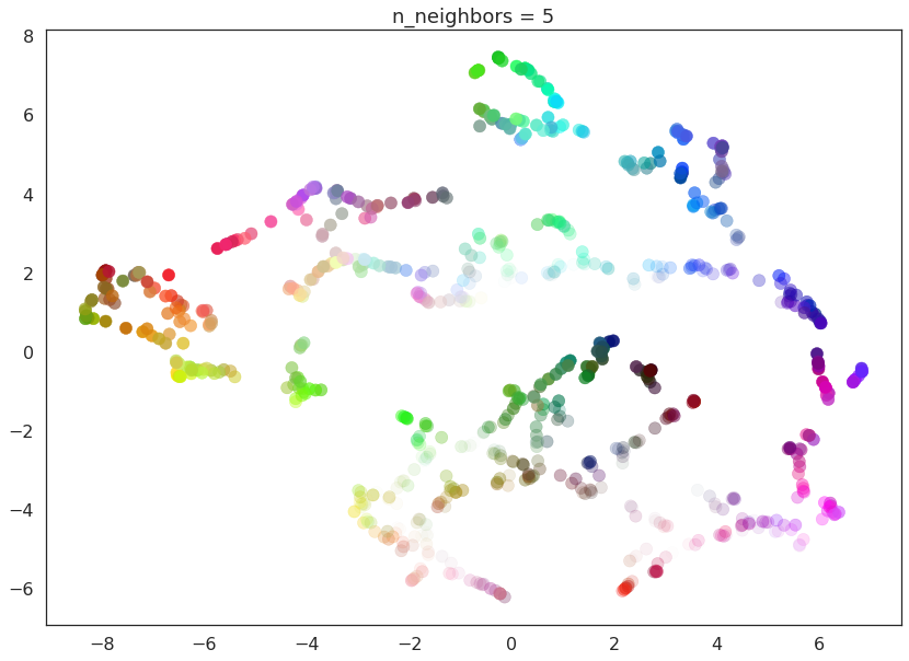
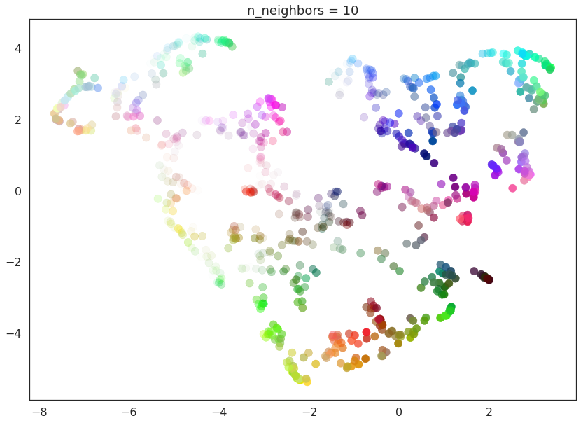
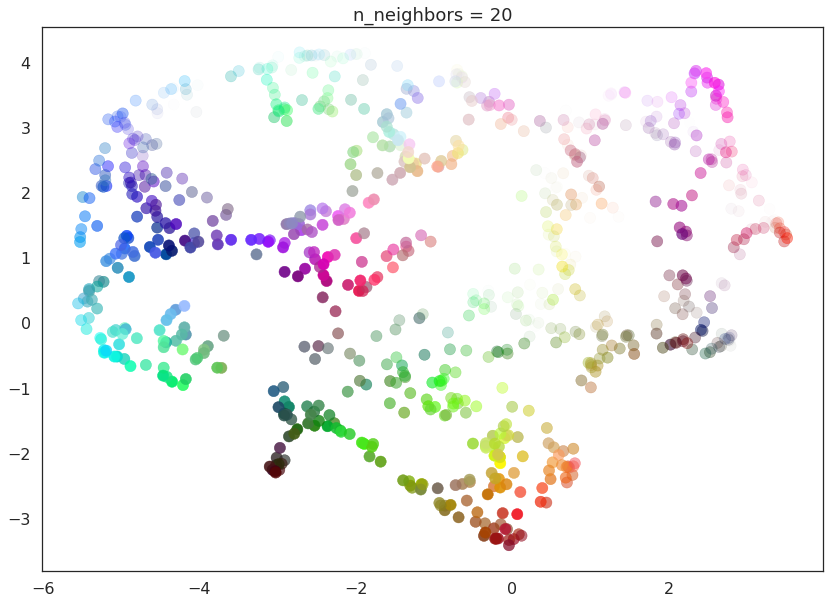
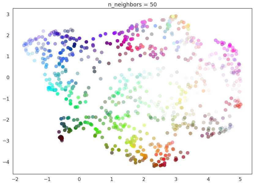
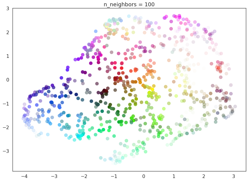
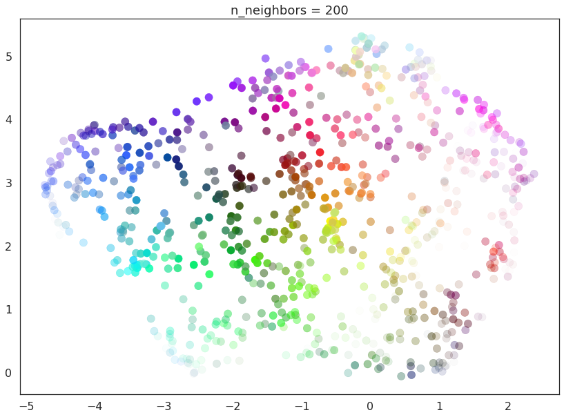
We can see that in practice by fitting our dataset with UMAP using a
range of n_neighbors values. The default value of n_neighbors
for UMAP (as used above) is 15, but we will look at values ranging from
2 (a very local view of the manifold) up to 200 (a quarter of the data).
for n in (2, 5, 10, 20, 50, 100, 200):
    draw_umap(n_neighbors=n, title='n_neighbors = {}'.format(n))
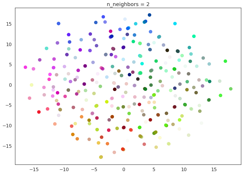
With a value of n_neighbors=2 we see that UMAP merely glues together
small chains, but due to the narrow/local view, fails to see how those
connect together. It also leaves many different components (and even
singleton points). This represents the fact that from a fine detail
point of view the data is very disconnected and scattered throughout the
space.
As n_neighbors is increased UMAP manages to see more of the overall
structure of the data, gluing more components together, and better
coverying the broader structure of the data. By the stage of
n_neighbors=20 we have a fairly good overall view of the data
showing how the various colors interelate to each other over the whole
dataset.
As n_neighbors increases further more and more focus in placed on
the overall structure of the data. This results in, with
n_neighbors=200 a plot where the overall structure (blues, greens,
and reds; high luminance versus low) is well captured, but at the loss
of some of the finer local sturcture (individual colors are no longer
necessarily immediately near their closest color match).
This effect well exemplifies the local/global tradeoff provided by
n_neighbors.
min_dist
The min_dist parameter controls how tightly UMAP is allowed to pack
points together. It, quite literally, provides the minimum distance
apart that points are allowed to be in the low dimensional
representation. This means that low values of min_dist will result
in clumpier embeddings. This can be useful if you are interested in
clustering, or in finer topological structure. Larger values of
min_dist will prevent UMAP from packing point together and will
focus instead on the preservation of the broad topological structure
instead.
The default value for min_dist (as used above) is 0.1. We will look
at a range of values from 0.0 through to 0.99.
for d in (0.0, 0.1, 0.25, 0.5, 0.8, 0.99):
    draw_umap(min_dist=d, title='min_dist = {}'.format(d))
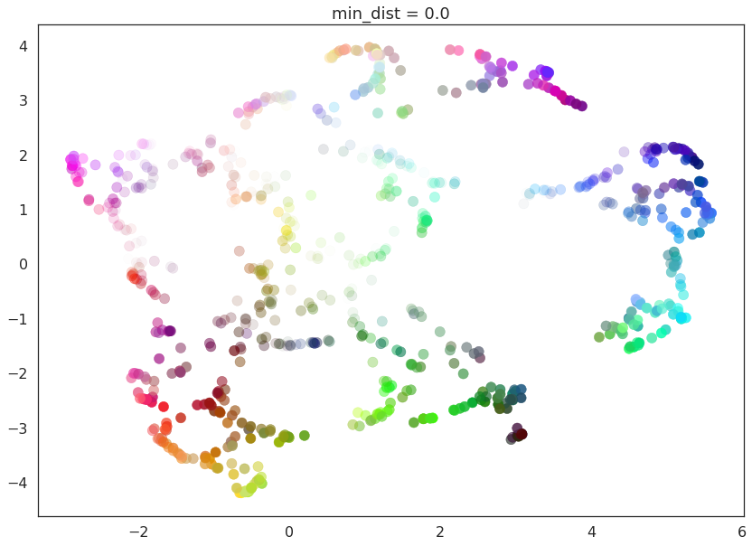
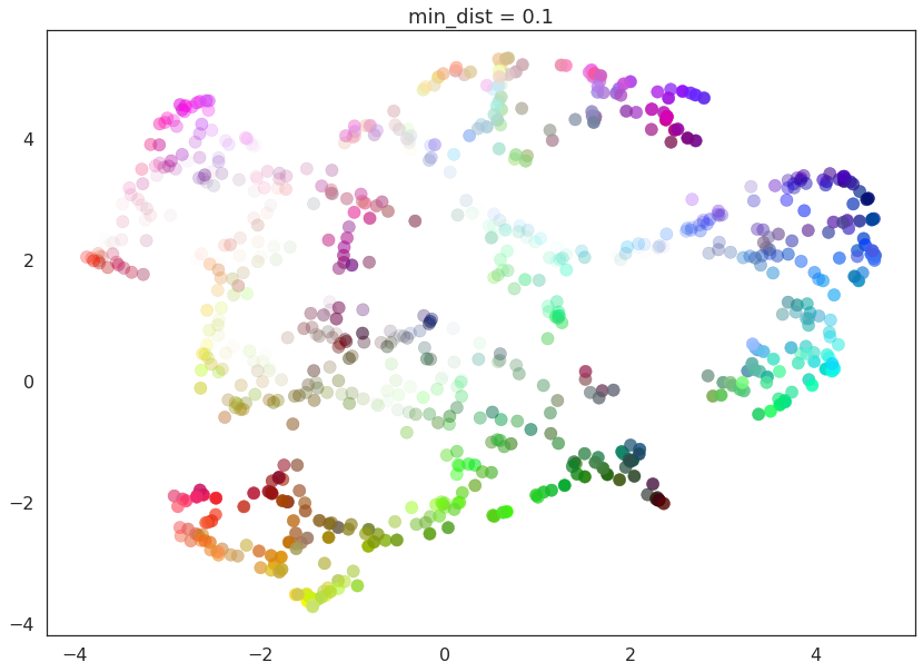
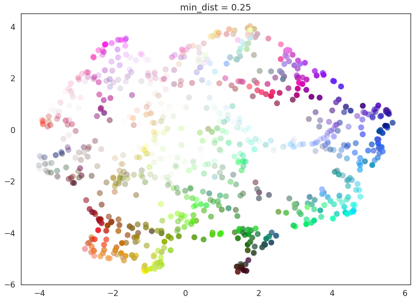
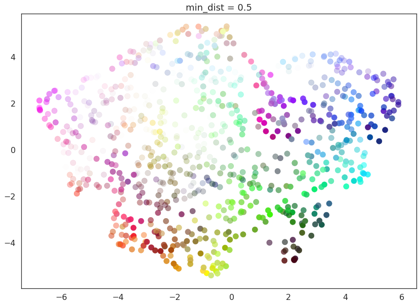
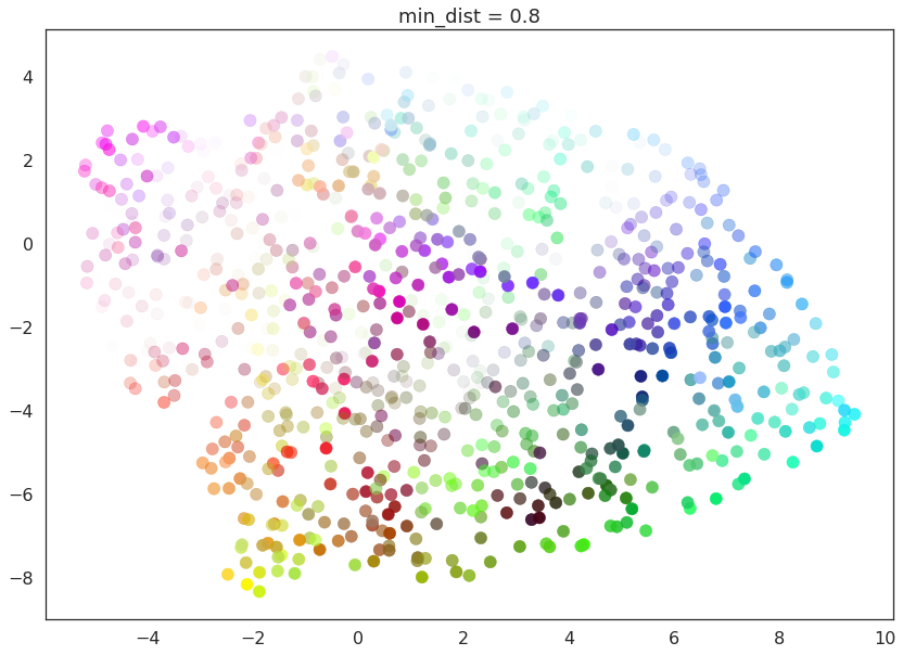
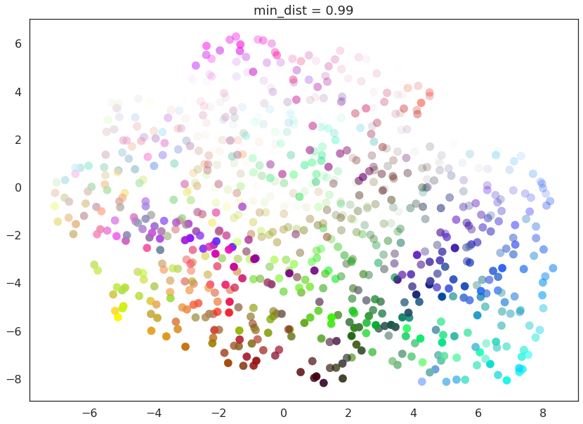
Here we see that with min_dist=0.0 UMAP manages to find small
connected components, clumps and strings in the data, and emphasises
these features in the resulting embedding. As min_dist is increased
these structures are pushed apart into softer more general features,
providing a better overarching view of the data at the loss of the more
detailed topological structure.
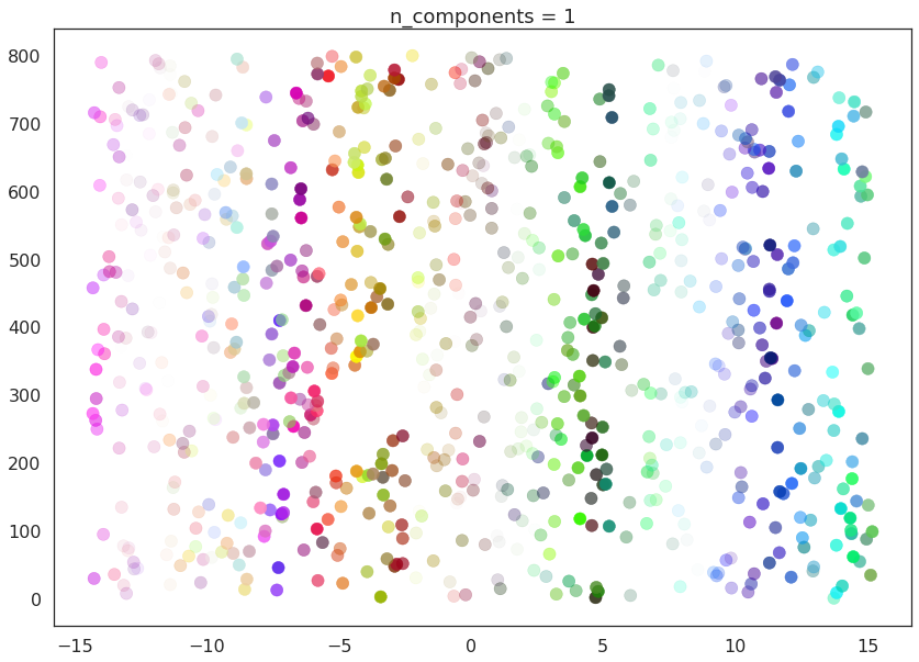
n_components
As is standard for many scikit-learn dimension reduction algorithms
UMAP provides a n_components parameter option that allows the user
to determine the dimensionality of the reduced dimension space we will
be embedding the data into. Unlike some other visualisation algorithms
such as t-SNE UMAP scales well in embedding dimension, so you can use it
for more than just visualisation in 2- or 3-dimensions.
For the purposes of this demonstration (so that we can see the effects of the parameter) we will only be looking at 1-dimensional and 3-dimensional embeddings, which we have some hope of visualizing.
First of all we will set n_components to 1, forcing UMAP to embed
the data in a line. For visualisation purposes we will randomly
distribute the data on the y-axis to provide some separation between
points.
draw_umap(n_components=1, title='n_components = 1')
Now we will try n_components=3. For visualisation we will make use
of matplotlib’s basic 3-dimensional plotting.
draw_umap(n_components=3, title='n_components = 3')
/opt/anaconda3/envs/umap_dev/lib/python3.6/site-packages/sklearn/metrics/pairwise.py:257: RuntimeWarning: invalid value encountered in sqrt
  return distances if squared else np.sqrt(distances, out=distances)
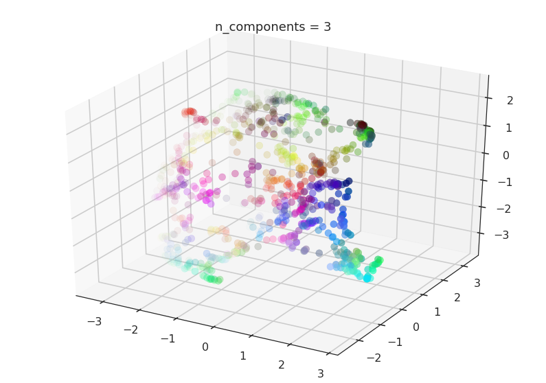
Here we can see that with more dimensions in which to work UMAP has an easier time separating out the colors in a way that respects the topological structure of the data.
As mentioned, there is really no requirement to stop at n_components
at 3. If you are interested in (density based) clustering, or other
machine learning techniques, it can be beneficial to pick a larger
embedding dimension (say 10, or 50) closer to the the dimension of the
underlying manifold on which your data lies.
metric
The final UMAP parameter we will be considering in this notebook is the
metric parameter. This controls how distance is computed in the
ambient space of the input data. By default UMAP supports a wide variety
of metrics, including:
Minkowski style metrics
- euclidean
- manhattan
- chebyshev
- minkowski
Miscellaneous spatial metrics
- canberra
- braycurtis
- haversine
Normalized spatial metrics
- mahalanobis
- wminkowski
- seuclidean
Angular and correlation metrics
- cosine
- correlation
Metrics for binary data
- hamming
- jaccard
- dice
- russellrao
- kulsinski
- rogerstanimoto
- sokalmichener
- sokalsneath
- yule
Any of which can be specified by setting metric='<metric name>'; for
example to use cosine distance as the metric you would use
metric='cosine'.
UMAP offers more than this however – it supports custom user defined
metrics as long as those metrics can be compiled in nopython mode by
numba. For this notebook we will be looking at such custom metrics. To
define such metrics we’ll need numba …
import numba
For our first custom metric we’ll define the distance to be the absolute value of difference in the red channel.
@numba.njit()
def red_channel_dist(a,b):
    return np.abs(a[0] - b[0])
To get more adventurous it will be useful to have some colorspace conversion – to keep things simple we’ll just use HSL formulas to extract the hue, saturation, and lightness from an (R,G,B) tuple.
@numba.njit()
def hue(r, g, b):
    cmax = max(r, g, b)
    cmin = min(r, g, b)
    delta = cmax - cmin
    if cmax == r:
        return ((g - b) / delta) % 6
    elif cmax == g:
        return ((b - r) / delta) + 2
    else:
        return ((r - g) / delta) + 4

@numba.njit()
def lightness(r, g, b):
    cmax = max(r, g, b)
    cmin = min(r, g, b)
    return (cmax + cmin) / 2.0

@numba.njit()
def saturation(r, g, b):
    cmax = max(r, g, b)
    cmin = min(r, g, b)
    chroma = cmax - cmin
    light = lightness(r, g, b)
    if light == 1:
        return 0
    else:
        return chroma / (1 - abs(2*light - 1))
With that in hand we can define three extra distances. The first simply measures the difference in hue, the second measures the euclidean distance in a combined saturation and lightness space, while the third measures distance in the full HSL space.
@numba.njit()
def hue_dist(a, b):
    diff = (hue(a[0], a[1], a[2]) - hue(b[0], b[1], b[2])) % 6
    if diff < 0:
        return diff + 6
    else:
        return diff

@numba.njit()
def sl_dist(a, b):
    a_sat = saturation(a[0], a[1], a[2])
    b_sat = saturation(b[0], b[1], b[2])
    a_light = lightness(a[0], a[1], a[2])
    b_light = lightness(b[0], b[1], b[2])
    return (a_sat - b_sat)**2 + (a_light - b_light)**2

@numba.njit()
def hsl_dist(a, b):
    a_sat = saturation(a[0], a[1], a[2])
    b_sat = saturation(b[0], b[1], b[2])
    a_light = lightness(a[0], a[1], a[2])
    b_light = lightness(b[0], b[1], b[2])
    a_hue = hue(a[0], a[1], a[2])
    b_hue = hue(b[0], b[1], b[2])
    return (a_sat - b_sat)**2 + (a_light - b_light)**2 + (((a_hue - b_hue) % 6) / 6.0)
With such custom metrics in hand we can get UMAP to embed the data using
those metrics to measure distance between our input data points. Note
that numba provides significant flexibility in what we can do in
defining distance functions. Despite this we retain the high performance
we expect from UMAP even using such custom functions.
for m in ("euclidean", red_channel_dist, sl_dist, hue_dist, hsl_dist):
    name = m if type(m) is str else m.__name__
    draw_umap(n_components=2, metric=m, title='metric = {}'.format(name))
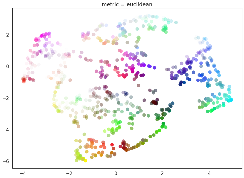
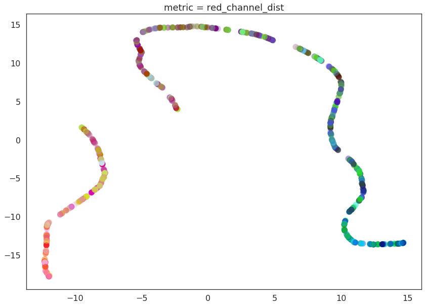
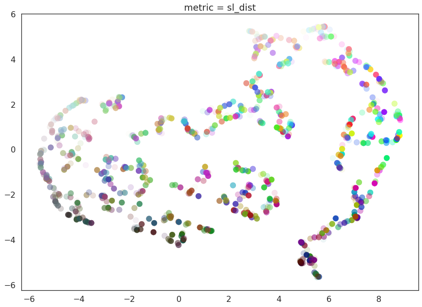
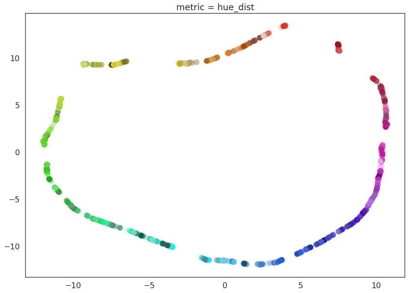
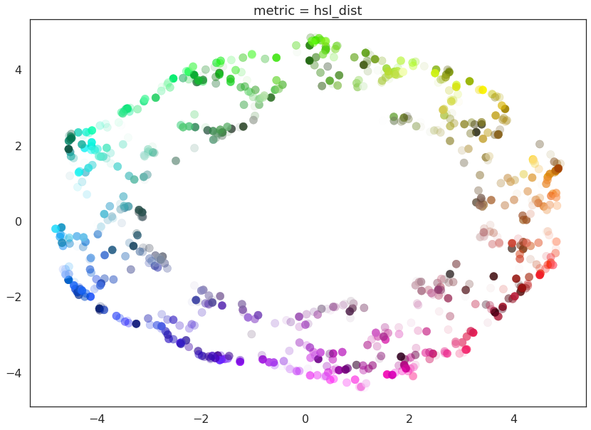
And here we can see the effects of the metrics quite clearly. The pure red channel correctly see the data as living on a one dimensional manifold, the hue metric interprets the data as living in a circle, and the HSL metric fattens out the circle according to the saturation and lightness. This provides a reasonable demonstration of the power and flexibility of UMAP in understanding the underlying topology of data, and finding a suitable low dimensional representation of that topology.