How to Use UMAP
UMAP is a general purpose manifold learning and dimension reduction algorithm. It is designed to be compatible with scikit-learn, making use of the same API and able to be added to sklearn pipelines. If you are already familiar with sklearn you should be able to use UMAP as a drop in replacement for t-SNE and other dimension reduction classes. If you are not so familiar with sklearn this tutorial will step you through the basics of using UMAP to transform and visualise data.
First we’ll need to import a bunch of useful tools. We will need numpy
obviously, but we’ll use some of the datasets available in sklearn, as
well as the train_test_split function to divide up data. Finally
we’ll need some plotting tools (matplotlib and seaborn) to help us
visualise the results of UMAP, and pandas to make that a little easier.
import numpy as np
from sklearn.datasets import load_digits
from sklearn.model_selection import train_test_split
from sklearn.preprocessing import StandardScaler
import matplotlib.pyplot as plt
import seaborn as sns
import pandas as pd
%matplotlib inline
sns.set(style='white', context='notebook', rc={'figure.figsize':(14,10)})
Penguin data

The next step is to get some data to work with. To ease us into things we’ll start with the penguin dataset. It isn’t very representative of what real data would look like, but it is small both in number of points and number of features, and will let us get an idea of what the dimension reduction is doing.
penguins = pd.read_csv("https://raw.githubusercontent.com/allisonhorst/palmerpenguins/c19a904462482430170bfe2c718775ddb7dbb885/inst/extdata/penguins.csv")
penguins.head()
| species | island | bill_length_mm | bill_depth_mm | flipper_length_mm | body_mass_g | sex | year | |
|---|---|---|---|---|---|---|---|---|
| 0 | Adelie | Torgersen | 39.1 | 18.7 | 181.0 | 3750.0 | male | 2007 |
| 1 | Adelie | Torgersen | 39.5 | 17.4 | 186.0 | 3800.0 | female | 2007 |
| 2 | Adelie | Torgersen | 40.3 | 18.0 | 195.0 | 3250.0 | female | 2007 |
| 3 | Adelie | Torgersen | NaN | NaN | NaN | NaN | NaN | 2007 |
| 4 | Adelie | Torgersen | 36.7 | 19.3 | 193.0 | 3450.0 | female | 2007 |
Since this is for demonstration purposes we will get rid of the NAs in the data; in a real world setting one would wish to take more care with proper handling of missing data.
penguins = penguins.dropna()
penguins.species.value_counts()
Adelie       146
Gentoo       119
Chinstrap     68
Name: species, dtype: int64

See the github repostiory for more details about the dataset itself. It consists of measurements of bill (culmen) and flippers and weights of three species of penguins, along with some other metadata about the penguins. In total we have 333 different penguins measured. Visualizing this data is a little bit tricky since we can’t plot in 4 dimensions easily. Fortunately four is not that large a number, so we can just do a pairwise feature scatterplot matrix to get an idea of what is going on. Seaborn makes this easy.
sns.pairplot(penguins.drop("year", axis=1), hue='species');
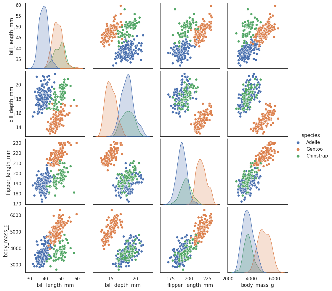
This gives us some idea of what the data looks like by giving as all the 2D views of the data. Four dimensions is low enough that we can (sort of) reconstruct what the full dimensional data looks like in our heads. Now that we sort of know what we are looking at, the question is what can a dimension reduction technique like UMAP do for us? By reducing the dimension in a way that preserves as much of the structure of the data as possible we can get a visualisable representation of the data allowing us to “see” the data and its structure and begin to get some intuition about the data itself.
To use UMAP for this task we need to first construct a UMAP object that will do the job for us. That is as simple as instantiating the class. So let’s import the umap library and do that.
import umap
reducer = umap.UMAP()
Before we can do any work with the data it will help to clean up it a little. We won’t need NAs, we just want the measurement columns, and since the measurements are on entirely different scales it will be helpful to convert each feature into z-scores (number of standard deviations from the mean) for comparability.
penguin_data = penguins[
    [
        "bill_length_mm",
        "bill_depth_mm",
        "flipper_length_mm",
        "body_mass_g",
    ]
].values
scaled_penguin_data = StandardScaler().fit_transform(penguin_data)
Now we need to train our reducer, letting it learn about the manifold.
For this UMAP follows the sklearn API and has a method fit which we
pass the data we want the model to learn from. Since, at the end of the
day, we are going to want to reduced representation of the data we will
use, instead, the fit_transform method which first calls fit and
then returns the transformed data as a numpy array.
embedding = reducer.fit_transform(scaled_penguin_data)
embedding.shape
(333, 2)
The result is an array with 333 samples, but only two feature columns
(instead of the four we started with). This is because, by default, UMAP
reduces down to 2D. Each row of the array is a 2-dimensional
representation of the corresponding penguin. Thus we can plot the
embedding as a standard scatterplot and color by the target array
(since it applies to the transformed data which is in the same order as
the original).
plt.scatter(
    embedding[:, 0],
    embedding[:, 1],
    c=[sns.color_palette()[x] for x in penguins.species.map({"Adelie":0, "Chinstrap":1, "Gentoo":2})])
plt.gca().set_aspect('equal', 'datalim')
plt.title('UMAP projection of the Penguin dataset', fontsize=24);
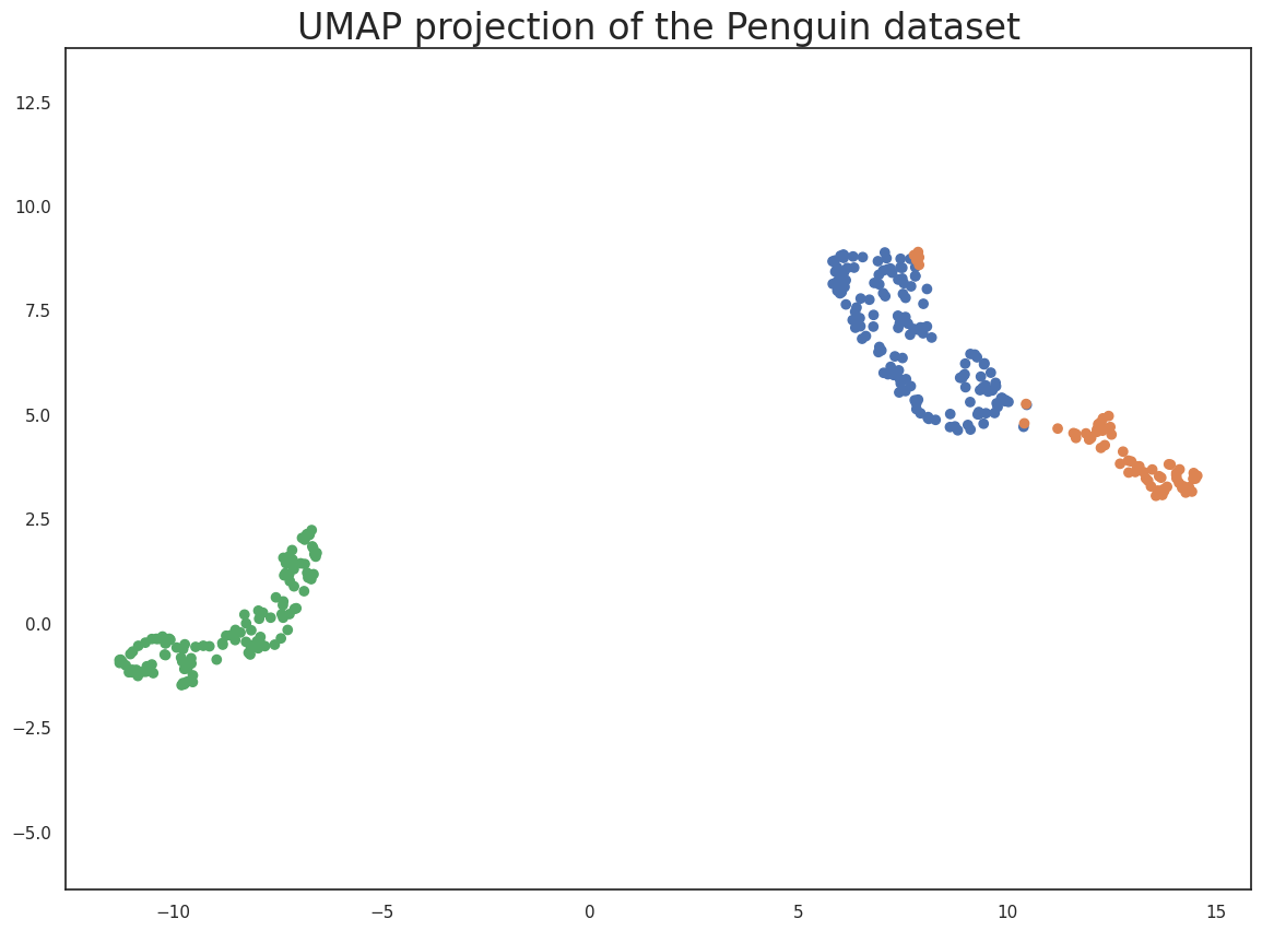
This does a useful job of capturing the structure of the data, and as can be seen from the matrix of scatterplots this is relatively accurate. Of course we learned at least this much just from that matrix of scatterplots – which we could do since we only had four different dimensions to analyse. If we had data with a larger number of dimensions the scatterplot matrix would quickly become unwieldy to plot, and far harder to interpret. So moving on from the Penguin dataset, let’s consider the digits dataset.
Digits data
First we will load the dataset from sklearn.
digits = load_digits()
print(digits.DESCR)
.. _digits_dataset:

Optical recognition of handwritten digits dataset
--------------------------------------------------

Data Set Characteristics:

    :Number of Instances: 5620
    :Number of Attributes: 64
    :Attribute Information: 8x8 image of integer pixels in the range 0..16.
    :Missing Attribute Values: None
    :Creator: E. Alpaydin (alpaydin '@' boun.edu.tr)
    :Date: July; 1998

This is a copy of the test set of the UCI ML hand-written digits datasets
https://archive.ics.uci.edu/ml/datasets/Optical+Recognition+of+Handwritten+Digits

The data set contains images of hand-written digits: 10 classes where
each class refers to a digit.

Preprocessing programs made available by NIST were used to extract
normalized bitmaps of handwritten digits from a preprinted form. From a
total of 43 people, 30 contributed to the training set and different 13
to the test set. 32x32 bitmaps are divided into nonoverlapping blocks of
4x4 and the number of on pixels are counted in each block. This generates
an input matrix of 8x8 where each element is an integer in the range
0..16. This reduces dimensionality and gives invariance to small
distortions.

For info on NIST preprocessing routines, see M. D. Garris, J. L. Blue, G.
T. Candela, D. L. Dimmick, J. Geist, P. J. Grother, S. A. Janet, and C.
L. Wilson, NIST Form-Based Handprint Recognition System, NISTIR 5469,
1994.

.. topic:: References

  - C. Kaynak (1995) Methods of Combining Multiple Classifiers and Their
    Applications to Handwritten Digit Recognition, MSc Thesis, Institute of
    Graduate Studies in Science and Engineering, Bogazici University.
  - E. Alpaydin, C. Kaynak (1998) Cascading Classifiers, Kybernetika.
  - Ken Tang and Ponnuthurai N. Suganthan and Xi Yao and A. Kai Qin.
    Linear dimensionalityreduction using relevance weighted LDA. School of
    Electrical and Electronic Engineering Nanyang Technological University.
    2005.
  - Claudio Gentile. A New Approximate Maximal Margin Classification
    Algorithm. NIPS. 2000.
We can plot a number of the images to get an idea of what we are looking at. This just involves matplotlib building a grid of axes and then looping through them plotting an image into each one in turn.
fig, ax_array = plt.subplots(20, 20)
axes = ax_array.flatten()
for i, ax in enumerate(axes):
    ax.imshow(digits.images[i], cmap='gray_r')
plt.setp(axes, xticks=[], yticks=[], frame_on=False)
plt.tight_layout(h_pad=0.5, w_pad=0.01)
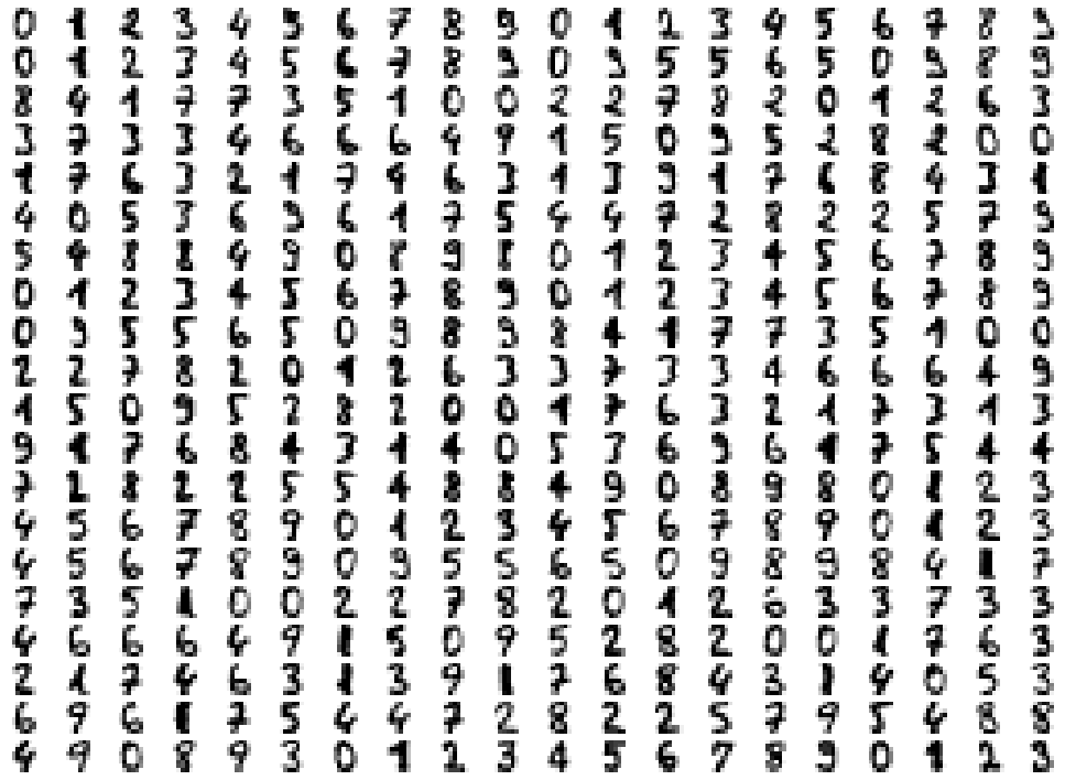
As you can see these are quite low resolution images – for the most part they are recognisable as digits, but there are a number of cases that are sufficiently blurred as to be questionable even for a human to guess at. The zeros do stand out as the easiest to pick out as notably different and clearly zeros. Beyond that things get a little harder: some of the squashed thing eights look awfully like ones, some of the threes start to look a little like crossed sevens when drawn badly, and so on.
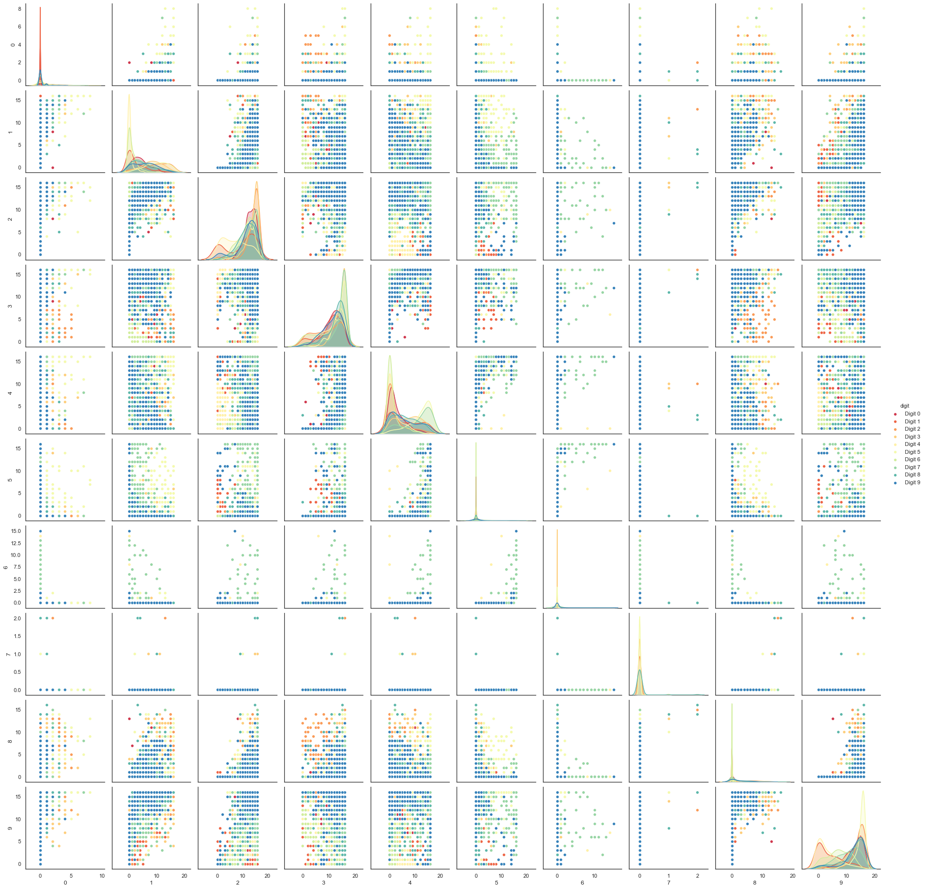
Each image can be unfolded into a 64 element long vector of grayscale values. It is these 64 dimensional vectors that we wish to analyse: how much of the digits structure can we discern? At least in principle 64 dimensions is overkill for this task, and we would reasonably expect that there should be some smaller number of “latent” features that would be sufficient to describe the data reasonably well. We can try a scatterplot matrix – in this case just of the first 10 dimensions so that it is at least plottable, but as you can quickly see that approach is not going to be sufficient for this data.
digits_df = pd.DataFrame(digits.data[:,1:11])
digits_df['digit'] = pd.Series(digits.target).map(lambda x: 'Digit {}'.format(x))
sns.pairplot(digits_df, hue='digit', palette='Spectral');
In contrast we can try using UMAP again. It works exactly as before:
construct a model, train the model, and then look at the transformed
data. To demonstrate more of UMAP we’ll go about it differently this
time and simply use the fit method rather than the fit_transform
approach we used for Penguins.
reducer = umap.UMAP(random_state=42)
reducer.fit(digits.data)
UMAP(a=None, angular_rp_forest=False, b=None,
     force_approximation_algorithm=False, init='spectral', learning_rate=1.0,
     local_connectivity=1.0, low_memory=False, metric='euclidean',
     metric_kwds=None, min_dist=0.1, n_components=2, n_epochs=None,
     n_neighbors=15, negative_sample_rate=5, output_metric='euclidean',
     output_metric_kwds=None, random_state=42, repulsion_strength=1.0,
     set_op_mix_ratio=1.0, spread=1.0, target_metric='categorical',
     target_metric_kwds=None, target_n_neighbors=-1, target_weight=0.5,
     transform_queue_size=4.0, transform_seed=42, unique=False, verbose=False)
Now, instead of returning an embedding we simply get back the reducer
object, now having trained on the dataset we passed it. To access the
resulting transform we can either look at the embedding_ attribute
of the reducer object, or call transform on the original data.
embedding = reducer.transform(digits.data)
# Verify that the result of calling transform is
# idenitical to accessing the embedding_ attribute
assert(np.all(embedding == reducer.embedding_))
embedding.shape
(1797, 2)
We now have a dataset with 1797 rows (one for each hand-written digit sample), but only 2 columns. As with the Penguins example we can now plot the resulting embedding, coloring the data points by the class that they belong to (i.e. the digit they represent).
plt.scatter(embedding[:, 0], embedding[:, 1], c=digits.target, cmap='Spectral', s=5)
plt.gca().set_aspect('equal', 'datalim')
plt.colorbar(boundaries=np.arange(11)-0.5).set_ticks(np.arange(10))
plt.title('UMAP projection of the Digits dataset', fontsize=24);
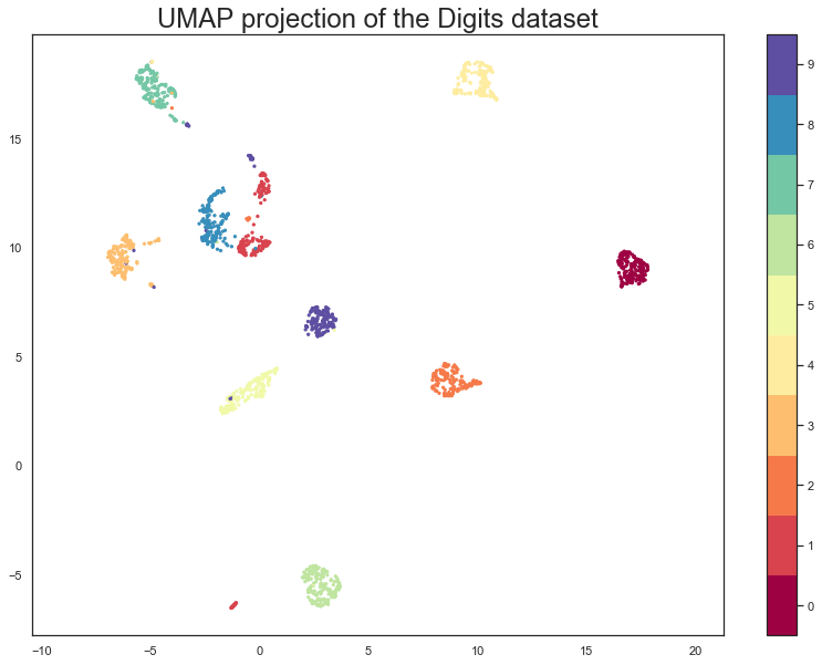
We see that UMAP has successfully captured the digit classes. There are also some interesting effects as some digit classes blend into one another (see the eights, ones, and sevens, with some nines in between), and also cases where digits are pushed away as clearly distinct (the zeros on the right, the fours at the top, and a small subcluster of ones at the bottom come to mind). To get a better idea of why UMAP chose to do this it is helpful to see the actual digits involve. One can do this using bokeh and mouseover tooltips of the images.
First we’ll need to encode all the images for inclusion in a dataframe.
from io import BytesIO
from PIL import Image
import base64
def embeddable_image(data):
    img_data = 255 - 15 * data.astype(np.uint8)
    image = Image.fromarray(img_data, mode='L').resize((64, 64), Image.Resampling.BICUBIC)
    buffer = BytesIO()
    image.save(buffer, format='png')
    for_encoding = buffer.getvalue()
    return 'data:image/png;base64,' + base64.b64encode(for_encoding).decode()
Next we need to load up bokeh and the various tools from it that will be needed to generate a suitable interactive plot.
from bokeh.plotting import figure, show, output_notebook
from bokeh.models import HoverTool, ColumnDataSource, CategoricalColorMapper
from bokeh.palettes import Spectral10

output_notebook()
Finally we generate the plot itself with a custom hover tooltip that embeds the image of the digit in question in it, along with the digit class that the digit is actually from (this can be useful for digits that are hard even for humans to classify correctly).
digits_df = pd.DataFrame(embedding, columns=('x', 'y'))
digits_df['digit'] = [str(x) for x in digits.target]
digits_df['image'] = list(map(embeddable_image, digits.images))

datasource = ColumnDataSource(digits_df)
color_mapping = CategoricalColorMapper(factors=[str(9 - x) for x in digits.target_names],
                                       palette=Spectral10)

plot_figure = figure(
    title='UMAP projection of the Digits dataset',
    width=600,
    height=600,
    tools=('pan, wheel_zoom, reset')
)

plot_figure.add_tools(HoverTool(tooltips="""
<div>
    <div>
        <img src='@image' style='float: left; margin: 5px 5px 5px 5px'/>
    </div>
    <div>
        <span style='font-size: 16px; color: #224499'>Digit:</span>
        <span style='font-size: 18px'>@digit</span>
    </div>
</div>
"""))

plot_figure.scatter(
    'x',
    'y',
    source=datasource,
    color=dict(field='digit', transform=color_mapping),
    line_alpha=0.6,
    fill_alpha=0.6,
    size=4
)
show(plot_figure)
As can be seen, the nines that blend between the ones and the sevens are odd looking nines (that aren’t very rounded) and do, indeed, interpolate surprisingly well between ones with hats and crossed sevens. In contrast the small disjoint cluster of ones at the bottom of the plot is made up of ones with feet (a horizontal line at the base of the one) which are, indeed, quite distinct from the general mass of ones.
This concludes our introduction to basic UMAP usage – hopefully this has given you the tools to get started for yourself. Further tutorials, covering UMAP parameters and more advanced usage are also available when you wish to dive deeper.
Penguin data information
Peguin data are from:
Gorman KB, Williams TD, Fraser WR (2014) Ecological Sexual Dimorphism and Environmental Variability within a Community of Antarctic Penguins (Genus Pygoscelis). PLoS ONE 9(3): e90081. doi:10.1371/journal.pone.0090081
See the full paper HERE.
Original data access and use
From Gorman et al.: “Data reported here are publicly available within the PAL-LTER data system (datasets #219, 220, and 221): http://oceaninformatics.ucsd.edu/datazoo/data/pallter/datasets. These data are additionally archived within the United States (US) LTER Network’s Information System Data Portal: https://portal.lternet.edu/. Individuals interested in using these data are therefore expected to follow the US LTER Network’s Data Access Policy, Requirements and Use Agreement: https://lternet.edu/data-access-policy/.”
Anyone interested in publishing the data should contact Dr. Kristen Gorman about analysis and working together on any final products.
Penguin images by Alison Horst.